Visual Summary
Visual Summary Hazard Views
Mike Sierks
Created: Sep 27, 2024 - Updated: Sep 30, 2024
This User Guide provides an overview of the Hazard View within the Climate Explorer dashboard, a walkthrough of its functionality (e.g., toggle through hazards), and tips on how to interpret the risk data and graphics.
Overview
Once a portfolio of assets has been uploaded (for help, see Uploading a portfolio), this dashboard provides a geospatial representation of both asset location and physical hazard maps. In addition to global visualizations of hazard exposure, users can view comprehensive physical and financial risk analytics for each asset at the click of a mouse. The following sections give a step-by-step guide for the following:
- Viewing Asset Data
- Hazard-Specific Views
- Asset-Level Comprehensive Risk
Viewing Asset Data
The landing page for the Hazard dashboard begins with a map view of asset data (i.e., no hazard data). Figure 1 shows an example portfolio using publicly available utility data. Note that color-coding corresponds to utility type, which was a data field in the uploaded portfolio.
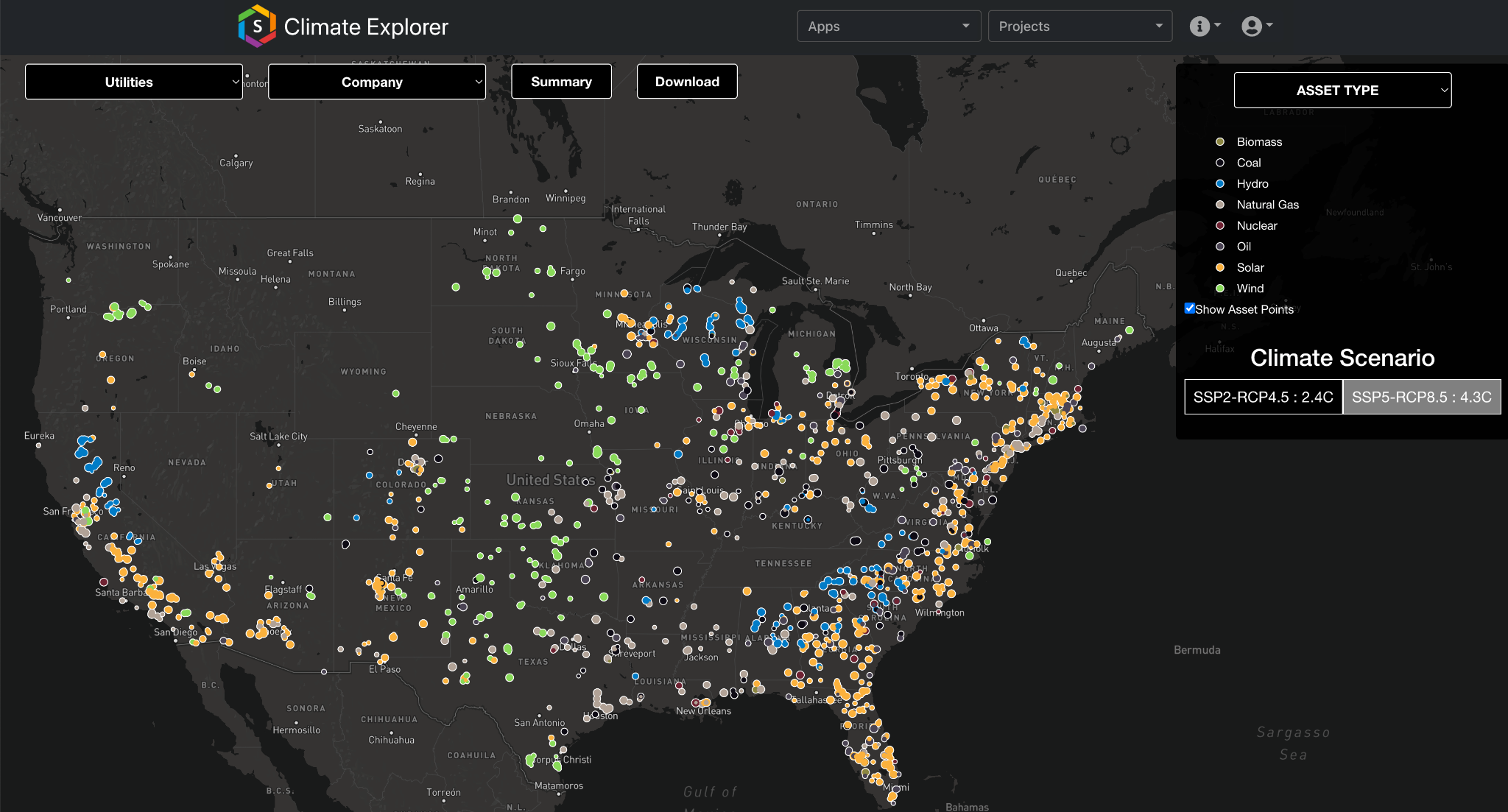
Figure 1: The dashboard landing page shows asset locations color-coded by a datafield named Asset Type.
For users with multiple portfolios, the top left-most dropdown bar (utilities in Fig. 1) can be used to switch between portfolios. Within a portfolio, users can subset asset data using the second-from-the-left dropdown bar (Company in Fig. 1) to view only assets of a certain type. The remaining top-screen icons (Summary and Download) aren’t dropdown bars. Download allows the user to download asset- and portfolio-level data on hazard exposure and subsequent financial loss. Summary provides a quick depiction of the assets with the largest hazard-induced financial risks (see Asset-Level Comprehensive Risk)
Hazard-Specific Views
The top-right dropdown bar (Asset Type in Fig. 1) allows the user to load the hazard exposure map for a selected hazard type. As seen in Figure 2, we switch from the initial Asset Type map to Flood. Exposure risk is shown in color shading (i.e., cyan in Fig. 2) and is displayed at the county-level for the US and an equivalent resolution across the globe. Although data is aggregated to this county-level for display purposes, the native risk data is calculated at a higher resolution. The next subsections of this document will walk through each item in the right-hand box (e.g., Risk Outlook).
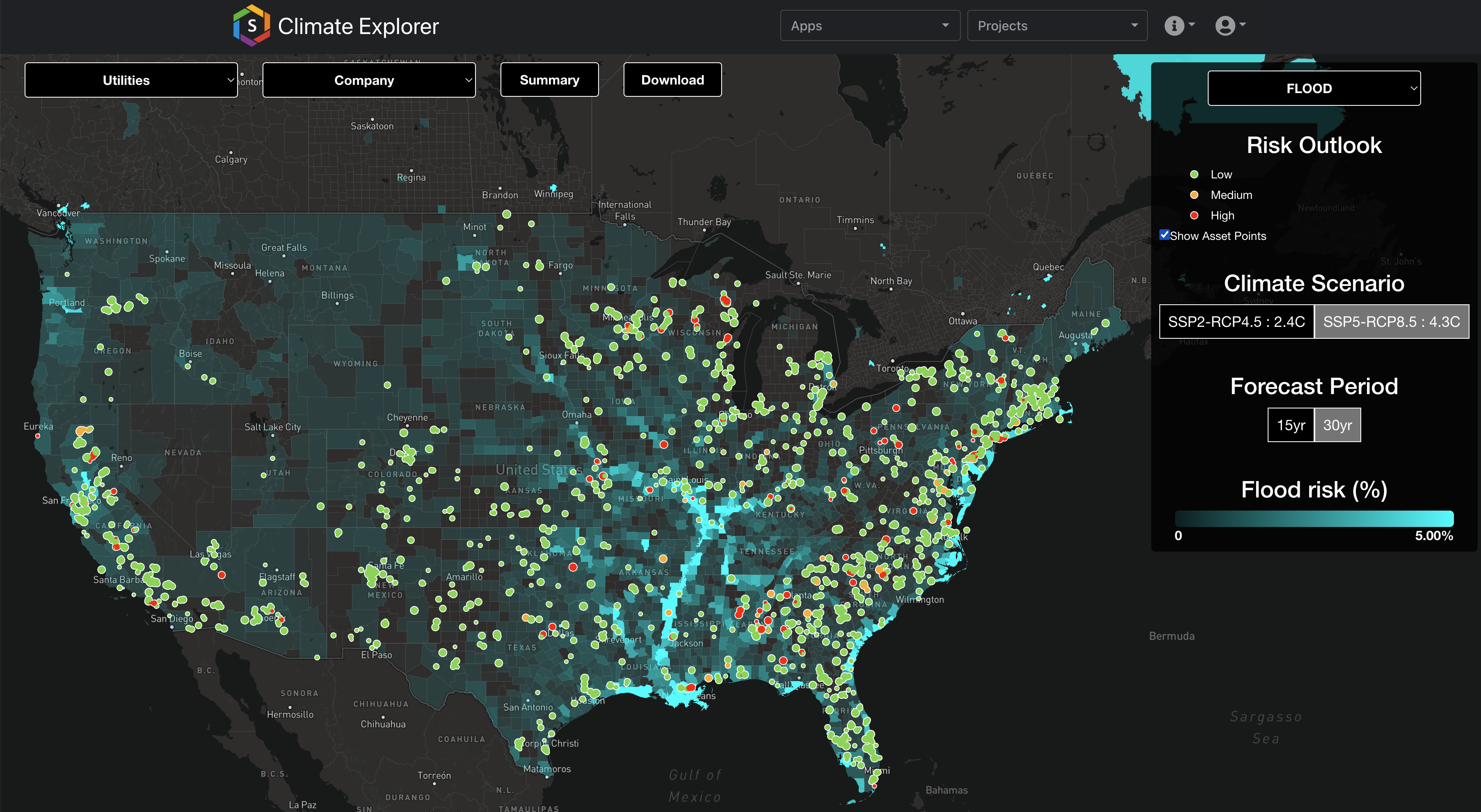
Fig 2: Flood risk (cyan) under the SSP5-RCP8.5 climate scenario over the 30 years with assets (markers) color-coded by exposure level.
Risk Outlook
When viewing hazard exposure, note that the marker legend has changed from the intial view (Fig. 1, asset type) to correspond to risk level (e.g., Low). For each asset, physical risk exposure is graded as Low (green), Medium (yellow), or High (red) (for greater detail, see Summarization Labeling). In addtion to color, asset markers vary by size according to the overall financial risk, with larger markers corresponding to heightened risk (see Asset-Level Comprehensive Risk)
Climate Scenario
Hazard exposure can be viewed for two different climate scenarios (for greater detail, see Climate Scenarios). By clicking on the respective buttons, the user can toggle between SSP2-RCP4.5 which corresponds to a “Middle of the Road” future and SSP5-RCP8.5 which corresponds to a “High Emissions” future. The average global warming at 2100 associated with each scenario is 2.4°C and 4.3°C, respectively.
Forecast Period
In addition to toggling between climate scenarios, the user can select between two time-windows of data: 15yr and 30yr. The 15yr window corresponds to the next 15 years (i.e., 2024-2039) with the 30yr window showing exposure over the next 30 years (i.e., 2024-2054).
Exposure Risk
The legend for hazard risk color-shading appears at the bottom of the right-hand box. Note, the hazard map is sensitive to the choice of Climate Scenario and Forecast Period. For greater detail on hazard exposure metrics, see the Data Guide.
Asset-Level Comprehensive Risk
A user can click on an asset to learn greater detail of hazard exposure and subsequent financial risk (Fig. 3). A pop-up box will open on the left-hand side beginning with asset name and location details at the top. Below there, three panels of figures depict risk analytics of the single asset as well as put its risk profile in the context of the broader portfolio (see below).
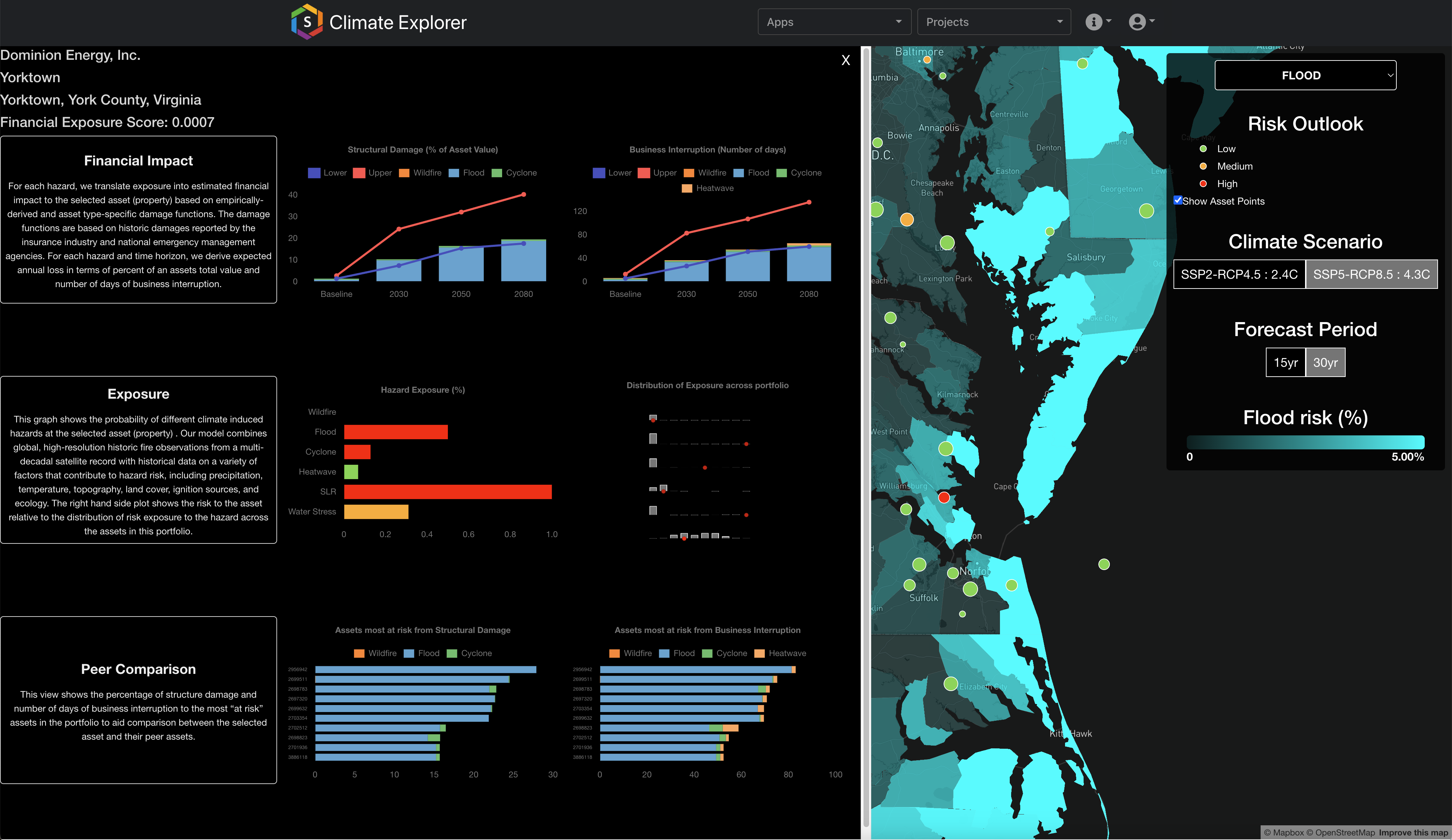
Fig 3: Pop-up window showing the comprehensive risk analytics for a given asset. This window appears when a user clicks on an asset.
Financial Impact
The top panel of the asset-level pop-up window shows projected financial impacts across 4 time horizons: Baseline, 2030, 2050, 2080, for two metrics: Structural Damage (left) and Business Interruption (right). For more information on finacial metrics, see Financial Risk Metrics. The height of each bar in the charts corresponds to the extent of financial risk with the individual contribution from each hazard type shown in color shading (e.g., Fig 4, Business Interruption in 2080). Red and blue lines provide an estimate of uncertainty within the projections. The upper and lower bounds reflect the 16th and 84th confidence interval bands, which corresponds approximately to +/- 1 standard deviation. Occasionally, risk data skews towards either bound for a particular hazard type based on the hazard model. Generally, the probability bounds can never go below 0 or above 1. In the case of flood probability, values are capped at 0.5.
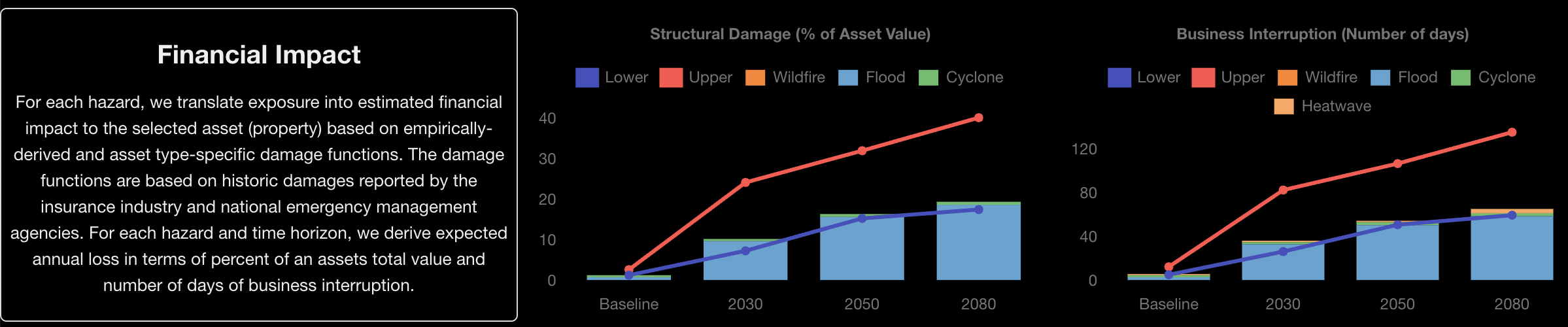
Fig 4: Top panel of the asset-level pop-up window shows metrics of financial impact: Structural Damage (left) and Business Interruption (right).
Exposure
The middle panel shows asset-level exposure across the 6 hazard types (Fig. 5, left) and contextualizes the asset’s exposure within the broader portfolio (Fig. 5, right). In the left-hand plot, the color-shading for each bar corresponds to the Low (green), Medium (yellow), or High (red) grading system introduced in Figure 2. Note that risk categorization differs between hazard types such that a value of 0.3 can be listed as High for Cyclones but Medium for Water Stress (as seen in Fig. 5).
The right-hand figure shows the distribution of exposure for each hazard across the portfolio of assets (Fig. 5 right, grey bars). The exposure value for the selected asset is shown by a red marker. In Figure 5, we see the risk for this asset is considerably higher than its portfolio-peers for Flood, Cyclone, and Sea Level Rise.
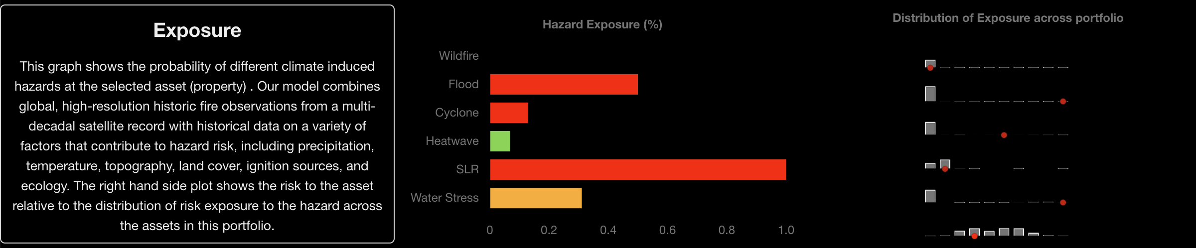
Fig 5: Middle panel of the asset-level pop-up window shows hazard exposure at the site (left) and in comparison to other asset's within a portfolio (right).
Peer Comparison
The bottom panel illustrates the 10 most at-risk assets within the portfolio with regards to Structural Damage (Fig. 6, left) and Business Interruption (Fig. 6, right). Similar to the top panel (Fig. 4), projected losses are broken down by hazard. Within this example portfolio, we find flooding to be responsible for the largest losses at the most at-risk sites.
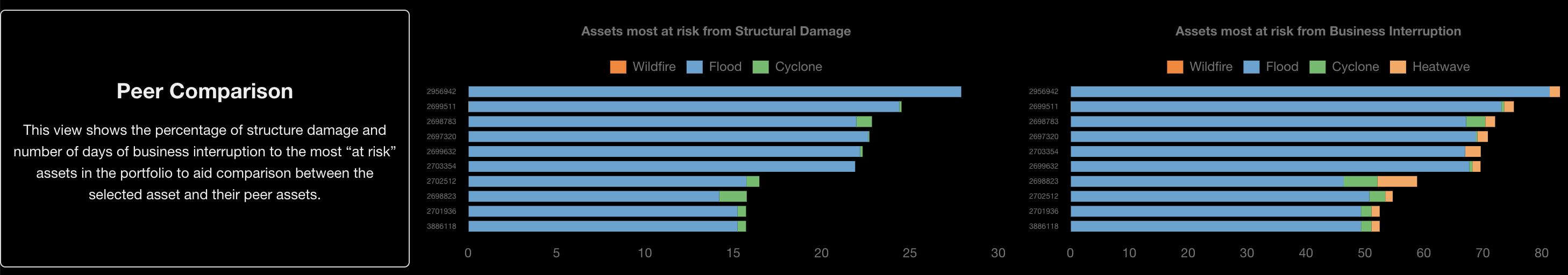
Fig 6: Bottom panel of the asset-level pop-up window shows the top 10 most at-risk assets in terms of their financial risk exposure for Structural Damage (left) and Business Interruption (right).